Report #18
Project: shop siyadatech.studio
2026-03-01 14:08:07
Description
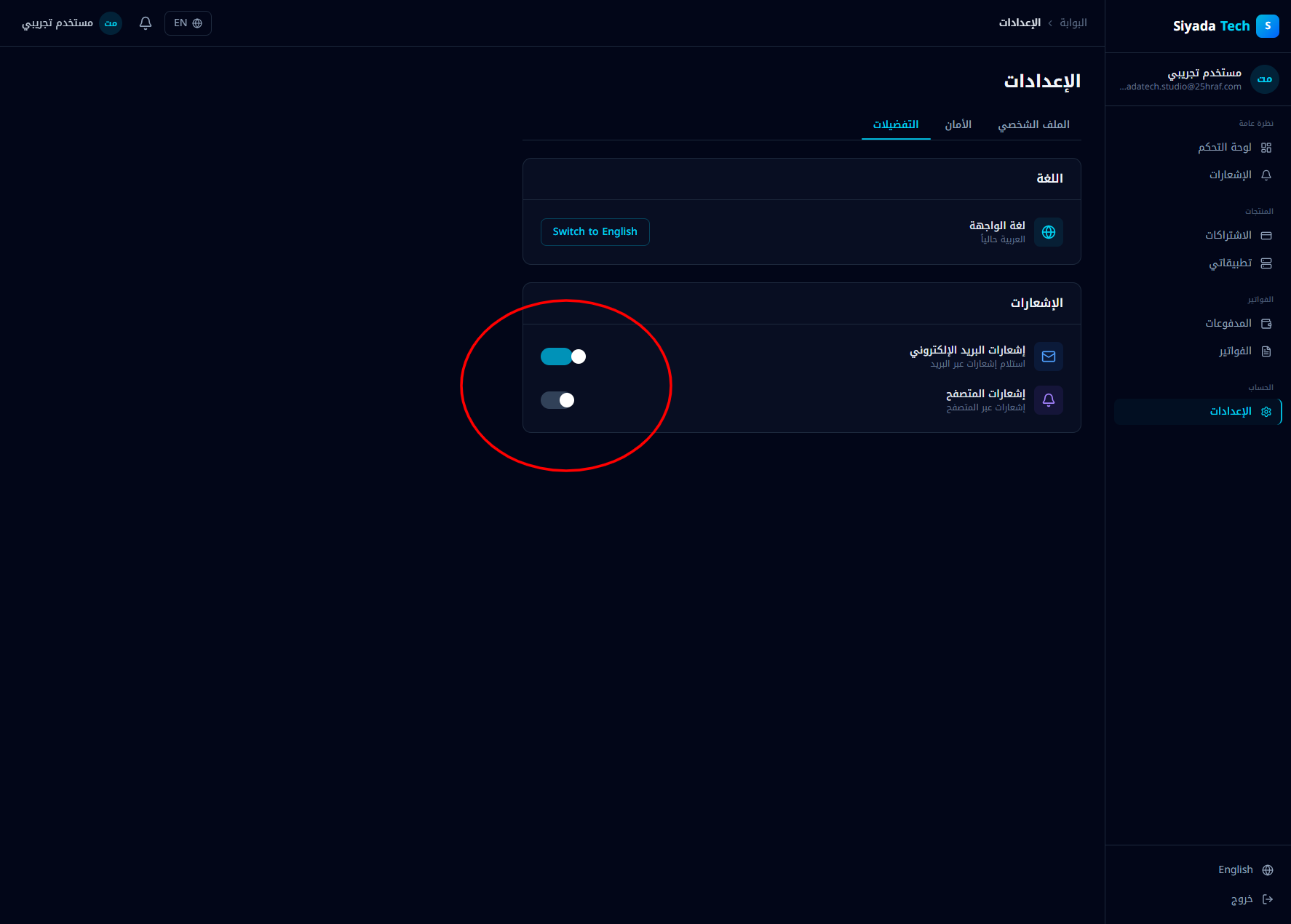
Issue description In the Settings → Notifications section, the toggle controls (visually styled like switches/radio buttons) are misaligned and visually inconsistent. The switch elements appear detached from their labels, improperly spaced, and not clearly associated with their respective notification options (Email notifications / In-app notifications). This results in: Poor visual hierarchy. Ambiguity about which switch controls which setting. UI inconsistency compared to the rest of the design system. Expected behavior Each notification option should have a clearly aligned label and its corresponding toggle control within the same row. The toggle should be visually anchored to its setting (consistent spacing, alignment, and grouping). The switch style should follow the design system standards (size, color states, RTL alignment). In Arabic (RTL), layout direction should correctly mirror alignment and spacing. Acceptance criteria Each notification setting is displayed in a single horizontal row containing: Icon Title Description Toggle switch aligned consistently (RTL-aware). Toggle switches are vertically centered relative to their labels. Spacing between elements is consistent with the app’s spacing system. No floating or misaligned controls appear detached from their labels. Switch state (on/off) is clearly distinguishable via color and position. Layout renders correctly in both Arabic (RTL) and English (LTR).
Screenshots & Video