Report #56
Project: RFP 3/5/2026
2026-05-03 09:41:50
Description
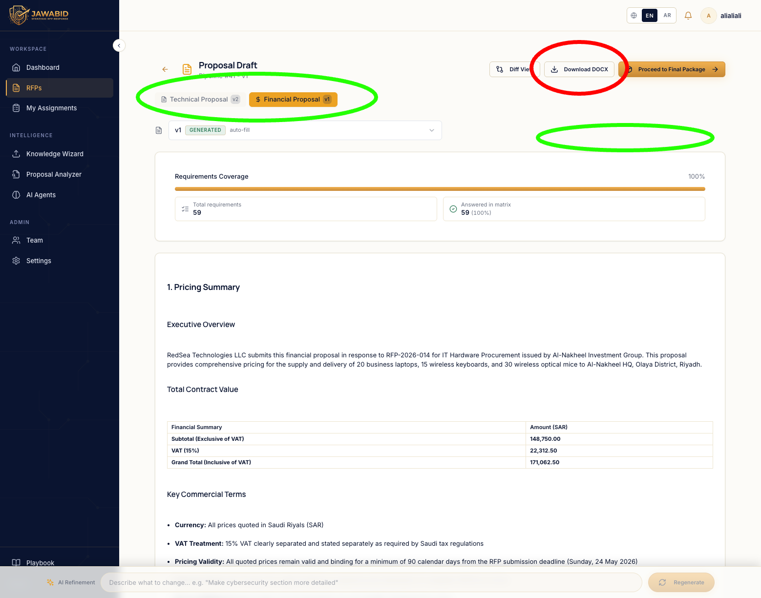
Issue: Download DOCX button placement is misleading in draft page Description On the Proposal Draft page, the current Download DOCX button is placed in the top-right action area, away from the document type/name tabs. This placement is confusing because the page has multiple document tabs, such as Technical Proposal and Financial Proposal. It is not immediately clear which document will be downloaded when clicking the button. Page/Screen Proposal Draft page Actual Result The Download DOCX button appears as a single global action in the top-right area. Because there are multiple document tabs, the user may not understand whether it downloads: * the currently selected document only * all documents * the technical proposal * the financial proposal Expected Result The download action should be visually connected to the document selection area, so the user clearly understands what will be downloaded. Suggested Improvements Option 1 — Move the button under/near the document tabs Place the Download DOCX button closer to the selected document type/name tabs, so it feels tied to the active document. Option 2 — Use a smart dropdown Replace the single button with a dropdown such as Download Documents, allowing the user to choose what to download: * Technical Proposal * Financial Proposal * Both documents Option 3 — Multi-select download Use a dropdown with checkboxes so the user can select one or more documents before downloading. Recommended Behavior
Screenshots & Video